This post contains a data visualization team project. The dataset consists of all information on the Formula 1 races, drivers, constructors, qualifying, circuits, lap times, pit stops, championships from 2011 till the latest 2024 season.
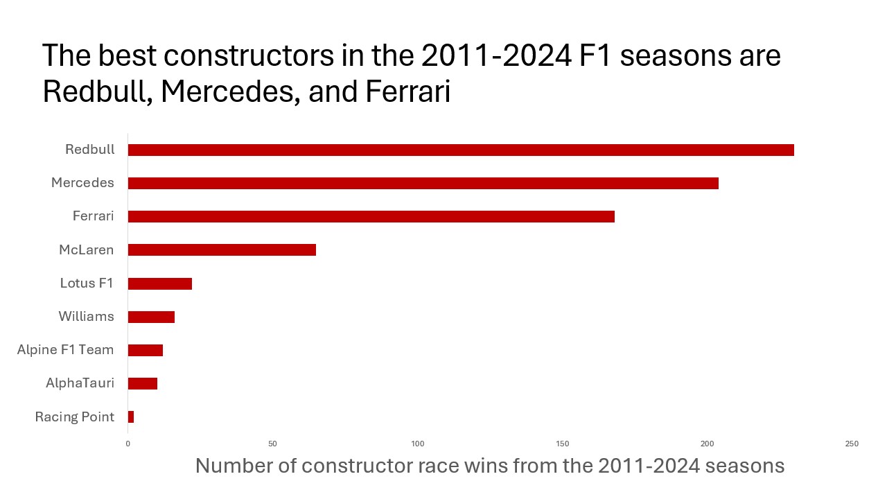
Which constructor (team, essentially) overall has the most wins? This question was interesting to us because we wanted to see which team is running the show at Formula 1. Used the constructor_standings dataset and filtered it down to count only wins from 2011 onwards, and then used a pivot table of that data to see which constructorid was tied to which constructor, then created the bar graph from that. We created the chart by removing chart title and border, making the histogram red, and adding axis titles